
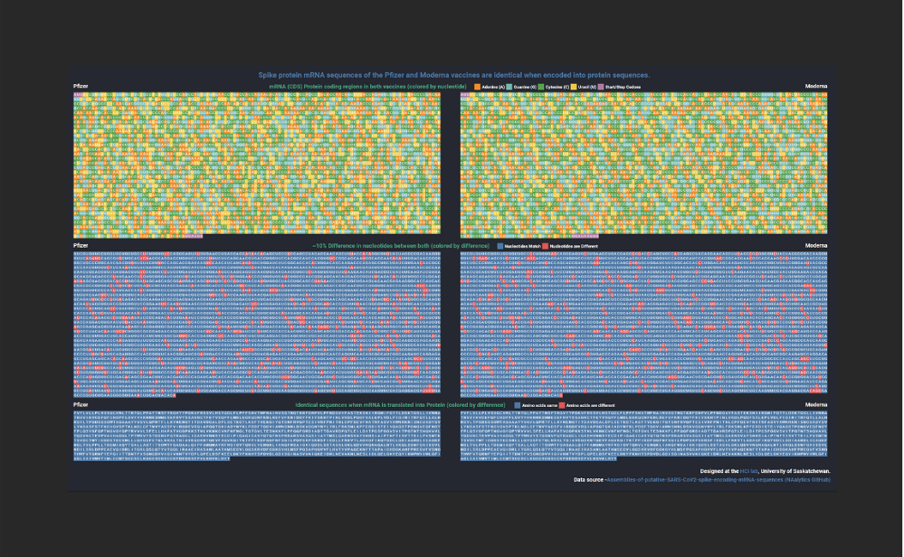
Data visualization shows the similarities in COVID-19 vaccines
Created by Research Technician Venkat Bandi, the visualization shows the similarities between the spike protein encoding mRNA sequence in the Pfizer and Moderna vaccines.
By Ellen RedlickThe idea for Venkat Bandi's latest project came from a recent personal experience. After receiving the Pfizer vaccine for his first dose, a shortage of Pfizer meant that he had to receive Moderna as his second dose. Out of curiosity, he created a visualization from publicly available datasets to see how similar the two vaccines are.
The visualization maps the nucleotide and amino acid sequences encoded by the two mRNA vaccines (Pfizer and Moderna). It depicts the similarities between the spike protein encoding regions of the two vaccines and shows that despite the 10% difference between the two mRNA sequences they are both identical when translated into their corresponding protein sequences.
The visualization shows that even though the two mRNA vaccines are from different manufacturers and have different ingredients (lipids to stabilise the mRNA) and dosage levels, they both have very similar underlying spike protein mRNA sequences. Further, when these mRNA sequences are translated into proteins, they both end up creating an identical protein sequence, which, in turn, matches with the spike protein found in the SARS-CoV-2 genome. Thus, ideally both the vaccines should create a similar immune response in our body against the spike protein and the SARS-CoV-2 virus.
Bandi credits the ease of creating this project to previous research done by the HCI Lab in visualizing genomic datasets, which has resulted in an extensive collection of reusable web modules for representing different kinds of genomic sequences. He leveraged some of these existing modules to create this new visualization.
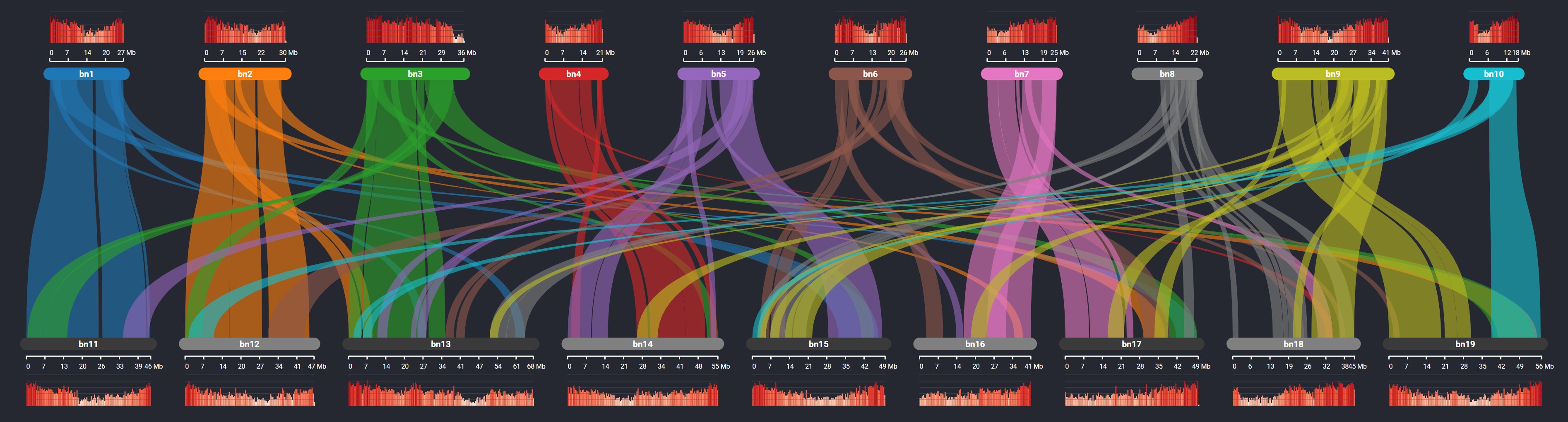
He notes that while the vaccine visualization itself is fairly simplistic, the HCI Lab has created a number of more complex tools for genome visualization. Their SynVisio tool is used for mapping collinearity among genomes and is currently being used by plant science researchers at Usask to visualize genome duplication in crops like canola, lentils and wheat. They are currently researching how to expand this work to map viral genomes like SARS-CoV-2.
An example of the output of their SynVisio tool is shown below. Extensive duplication in the genome of Brassica napus (canola) is indicated by the coloured ribbons linking regions of chromosomes where genes are conserved along with a corresponding histogram track showing gene density variations.
More complex genome visualization tools they have built as part of their research can be seen at https://genomevis.usask.ca.
Venkat Bandi completed his MSc in Computer Science in 2020 at the University of Saskatchewan under the supervision of Dr. Carl Gutwin. He is currently a web developer in the HCI lab working with Dr. Gutwin. His work is centered around building a suite of visualization tools and web interfaces for exploring genomic datasets and he works in collaboration with a diverse team of bioinformaticians, genome researchers and biologists.